Version 2.7 hasn’t brought a lot of changes, but instead it was more focused on bringing new and existing users to discover all the features the plugin has to offer, with the help of a Wizard.
Background
Since version 2.5, we’ve added analytics to the plugin to better understand users’ behavior with the plugin. And the results of this study were that most of the users were using the default settings. There are two reasons for such results, which are either:
- Users were fine with the default settings, which is fine since it’s the main selling point of the plugin; or:
- Users didn’t bother meddling with the settings or reading the documentation, which explains why a lot of users never heard about accent color or even the Material Theme Switcher.
As a result, we’ve started to wonder how to make users more aware of the different features of the plugin. Documentation
helps, but clearly nobody few people read the documentation, so we’ve ruled it out. Then I
remembered that IntelliJ products show a wizard at the first start, helping people discover features and plugins. If
there was a way to use it to display the plugin features, it would be great for new as well as existing users. And after
a bit of investigation, I’ve figured it out and started building the Material Theme Wizard.
Wizard
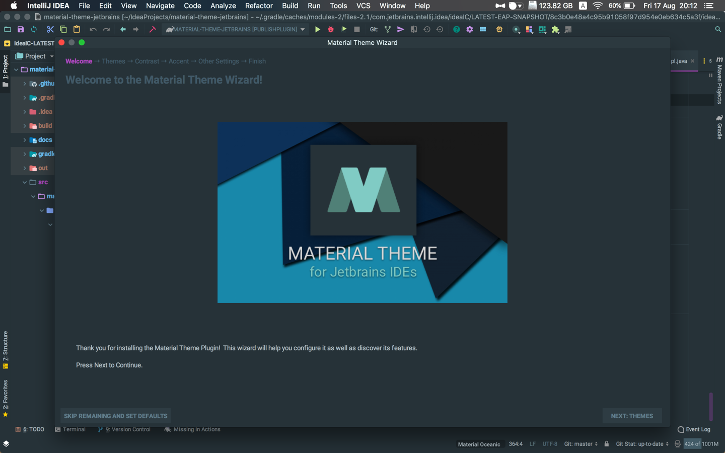
This wizard will show for all users, existing and new, but will only show once at the start of the application. Whenever you decide to follow it or to close it, it won’t show up again unless you click the Material Wizard action in the Material Toolbar.
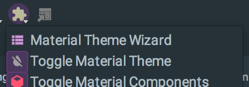
You can go step by step or click Skip all remaining defaults to close the wizard and keep your current settings.
The wizard consists of only four steps that showcase the most important features of the plugin:
- Themes
- Contrast modes
- Accent color
- Most useful options
Themes
This step will showcase the different themes offered by the plugin, along with a screenshot of what the IDE will look like.
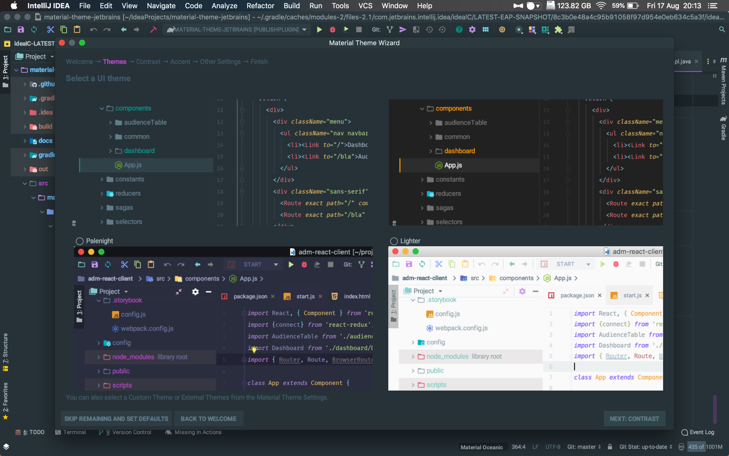
Contrast
This step displays the different contrast modes of the plugin. You can select either of them or both of them.
Accent Color
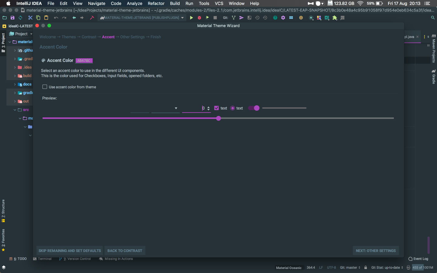
Here you can select the accent color used by the components of the IDE. A preview of some components is available to see how they will display with the selected color.
Plugin Settings
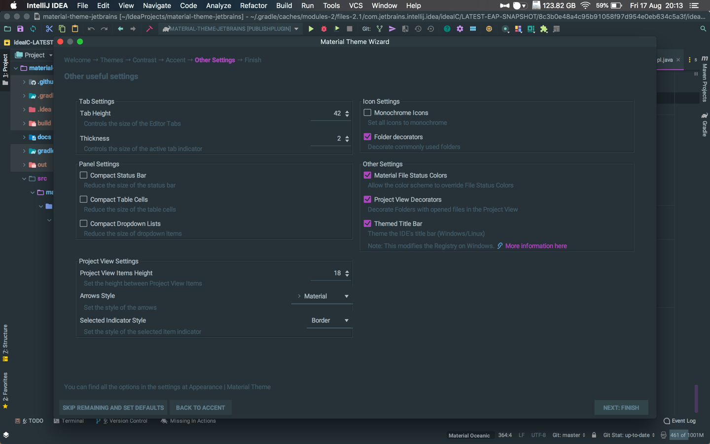
The last step is showing a list of the most used options of the plugin along with a short description of what they do.
Conclusion
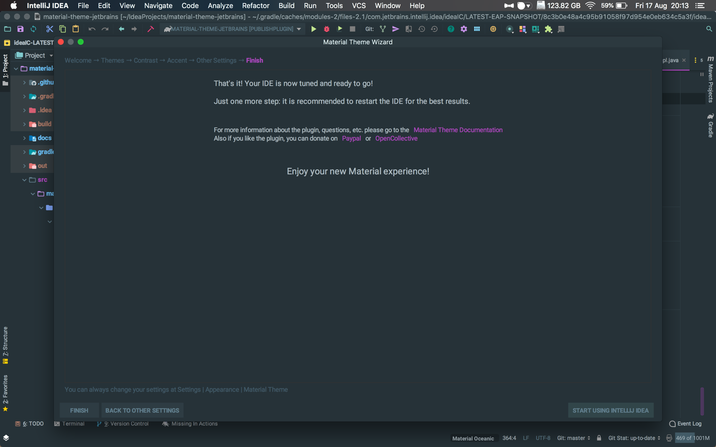
This last “step” is finalizing the wizard by offering users to restart to fully apply the settings. It’s also presenting links for the documentation or for supporting the plugin via the available options.
That’s it, you’ve configured the plugin! You can check other options in the settings page or run the wizard again from the Material Toolbar.