This feature is available in the free plan.
These settings control some components’ display, mainly about their compactness.
Compact statusbar
The IDE’s Status Bar went through a redesign as well, removing all borders and giving more padding on the top and bottom. This setting allows you to revert to the default “compact” design.


Compact table cells
Just like the status bar, table cells, table headers and list views were also given more padding to resemble more like Material Design’s equivalents.
This setting allows you to revert to the old, “compact” style. This can be useful if you have lots of items and don’t want to scroll endlessly.


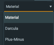
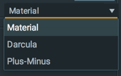
Compact dropdowns
This setting allows you to reduce the size of the dropdowns used in the UI to be more compact.
Compact menus
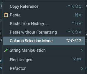
From version 2.10.2 Menus had also gained more padding just like dropdowns and tables.
As a result, a setting has been added to revert to the default menus size.
Compact fields
This setting allows you to reduce the size of the fields, that has become larger since version 6.14.
This option concerns Text Fields, Password Fields, Number Fields and Search Fields, as well as Search Everywhere, Find In Files, New File, etc.


Custom list items height
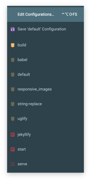
This setting allows you to customize the items’ height in lists, such as regular lists, dropdown options, etc.
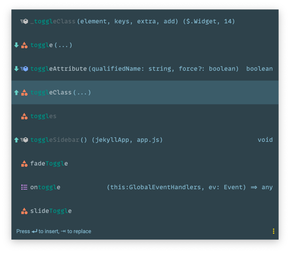
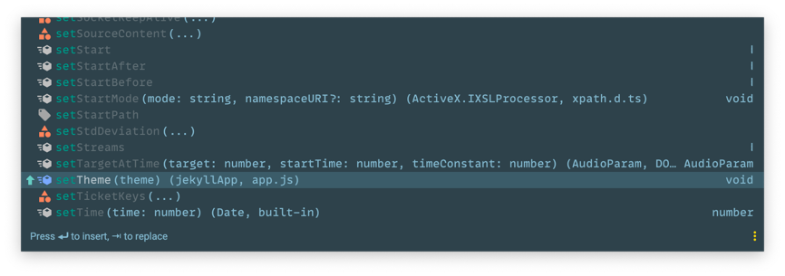
Note: this also affects *Autocompletion choices**.
Notes
- Because the IDE is developed with compact table cells in mind, using “padded table cells” may result of display issues in some components. One example is the Python DataView (https://github.com/ChrisRM/material-theme-jetbrains/issues/485). If you are using such features a lot, just enable the “Compact Table Cells” option to solve that problem.