This section describes the Accent Colors feature, and how it’s used by the plugin.
Definition
Accent Color refers to a color used to emphasize key parts of the UI, such as the active tab, focused input texts, checked boxes, etc. The Material Theme plugin enables this feature in the IDE and gives the ability to customize it to your heart’s content.
For more info about Accent Colors in the Material Design guidelines, follow this link: https://material.io/guidelines/style/color.html#color-color-system
Usage
Here is a non-exhaustive list of components where accent color is used:
- Active Tab Indicator
- Close tab button on hover
- Tree View selected item indicator
- Checked boxes
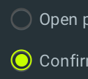
- Selected Radio buttons
- Focused text inputs
- Focused/Hovered comboboxes
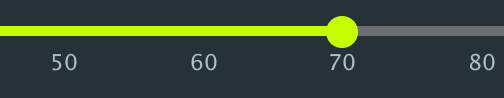
- Sliders
- Toggled Action buttons
- Code Completion pane
- Parameter Info
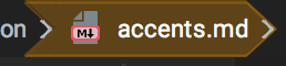
- Documentation’s links and bold texts
- Panels’ links
- Tree’s selected item expanded and collapsed icons
- Progress Bar
- Circular progress indicator
- Scrollbars (according to
Accent Scrollbarssetting) - VCS Log branches icon
- Caret Color
- Modified Setting Pages
- On/Off Switches in Search Everywhere/Execute Action
- Navigation Bar Focused Item
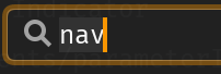
- Search terms in lists
- Accent Mode color
- Running Indicator in Run configurations
- And other use cases…
Customization
There are two ways of customizing the current accent color:
- By selecting a color from the list of available colors
- By setting a custom color in the settings
Accent color chooser
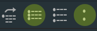
A list of predefined accent colors is available in the Material Config Toolbar. These are colors frequently used from the Material Design color palette.
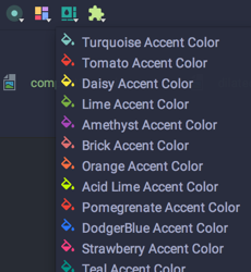
Here is the list of predefined colors:
Custom accent color
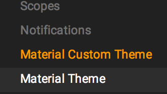
You can customize the accent color from the settings. Even when you choose a predefined color, you will see its value inside the settings.

Override Accent Color
Starting from version 2.6.0, there is the possibility to override the custom accent color with the default one bundled with the theme.
For instance, for Material Oceanic, the accent color will be teal while for Darker it will be orange, etc.
This is especially useful for external themes, so that Theme designers can provide their own accent color.
Gallery


