Some features are only available for premium users.
This page displays the features and settings that customize the appearance of the Editor Tabs and IDE Tabbed Panes.
Active tab options
Active tab highlighter
This setting controls the appearance of the little indicator under the current highlighted tab.

- When the setting is OFF, the indicator color would either be the one defined by the color scheme, according to the
TAB_UNDERLINEproperty, or the current accent color. - When the setting is ON, you can select your own custom color.
Thickness
This allows you to set the thickness of the tab highlighter.
To avoid crazy values that could ruin the UI, the values are limited between 1 to 5 pixels.
About tabs placement
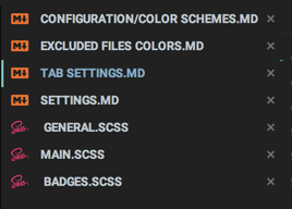
While most people set their tabs to be on the top, JetBrains IDEs also give the possibility to place your tabs to the bottom, left or right side.
In that case, the active tab indicator would be placed accordingly to the tab position:
- At the top for bottom placement
- At the right for right placement
- At the left for left placement
Other tab options
Uppercase Tabs
This feature allows you to set the tabs to look even more like the usual Material Design Tabs, e.g. in Uppercase.

This setting gets rid of special characters such as hyphens or underscores and replaces them with spaces. It also converts from camel-case to “Spaced Uppercase”.
Bold active tab
Previously, this setting was set via the Uppercase Bold Tabs, but was rather flaky, and not much useful since it made all tabs bolder.
Now, this setting controls the boldness of only the active, selected tab, making it more prominent.

Tab height
This setting allows you to customize the height of the different tabs of the IDE, such as editor tabs, debugger tabs, code style tabs, etc. This allows you to have the complete “Material Design Tabs” experience.
The allowed values are between 18 to 60 pixels, where the default recommended value for horizontal tabs is 50.
If you use vertical tabs though, the personal recommended value would be 25 so you can place more opened tabs at the side.

There is no reset button, but there is an action in the Material Toolbar that resets the value to its default value, 50.
Material tabbed panes
Since version 3.0.0 the Tab Settings control not only the appearance of the Editor Tabs but for all tabbed panes as well
(except for JBTabbedPanes such as the Tabs inside the Debugger Tool Window or Code Style Settings).
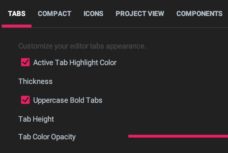
You can therefore customize:
- The active tab highlighter color and thickness
- The tab height
- Whether they appear as upper case bold.
Tab Shadow and Opacity have no effect here.
Tab highlighter position
A new setting has been added in 3.4.0 which allows you to tweak the position of the tab highlighter:


Custom tab font
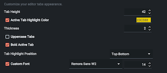
Since version 6.10.0 you have the ability to customize both the font family and size of the Editor tabs.


Animated Tabs
This feature is available in the free plan.
Version 7.8.0 introduced a cool option giving animations to the tab indicators.

Tab Separators
This feature is available in the free plan.
Version 7.11.0 introduces the support for Tab Separators.
These are thin, almost transparent borders that can be added between tabs to ease the distinction between them.


Per-project settings
Since version 6.6.0, you can also override specific tab settings on a per-project basis.
Such settings include:
- Active Tab Highlighter color and thickness
- Uppercase tabs
- Bold Active Tab
- Tab Highlighter Position

Other tweaks
Edited files icon
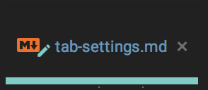
Files that are edited but not yet saved sport a little pencil icon with the current accent color on the tab, in place of the regular * asterisk *.
![]()
You need to activate this option under Editor → General → Editor Tabs → Mark modified tabs with asterisk
Pinned files’ icon
Same as the edited file icon, pinned tabs sports a little pin on the icon, colored with the current accent color.
![]()
Accent close icon
The close icon didn’t change, but sports the accent color when the cursor hovers it.
FAQ
Q: Is there a way to completely remove the Active Tab Indicator?
A: Not currently. Even disabling the feature in the IDE would still display the indicator provided by the plugin. If there is enough demand to add this feature, it could appear in the future.
Q: The Tab Height feature is cool in the editor, but I’d rather leave other tabs untouched.
A: It’s a valid opinion. Unfortunately, currently the setting that sets the tab height is shared between all tabs in the IDE, and there is no way to distinguish between them currently. Maybe in the future, if JetBrains provides more native customization.
Q: Why limit the thickness or the tab height? I want to have 10 in thickness and 100 in tabs!!!
A: Because allowing values past these limits would make the UI ugly or worse, crash it. If you have a good reason to want it anyway, you can open an issue on GitHub with why you would want that.
Q: The uppercase tabs feature is so useless! Editor Tabs !== Material Design Tabs!
A: This might be true, but it’s a matter of taste. It’s not enabled by default, so if it bothers you, you can simply turn it off.