Here you can find settings for the Icons provided by the plugin, whether to enable or disable the icons, completely hide them or applying a filter to them.
Atom Material Icons
The Atom Material Icons Plugin is a complementary plugin of the Material Theme whose purpose is to customize all IDE icons. It was originally part of the Material Theme but has been extracted from it since version 2.9.0, in order to tend to users who don’t need the themes but do need the icons, the same way it’s done in Atom or Visual Studio.

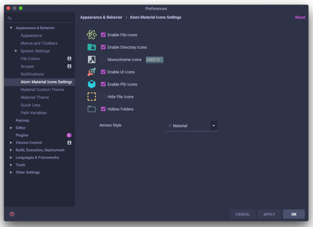
The UI is a bit different from the Material Theme UI but provides the same capability nonetheless.
This operation has been performed to decouple the Material Theme plugin from the UI Icons feature, therefore granting the ability to use different Icon Themes from other authors alongside the Material Theme UI, and at the same time gives the ability to use the icons independently of the UI themes.
Note: This plugin has been ported to Google Chrome and Firefox! Go take a look: Atom Material Icons for Chrome and Atom Material Icons for Firefox
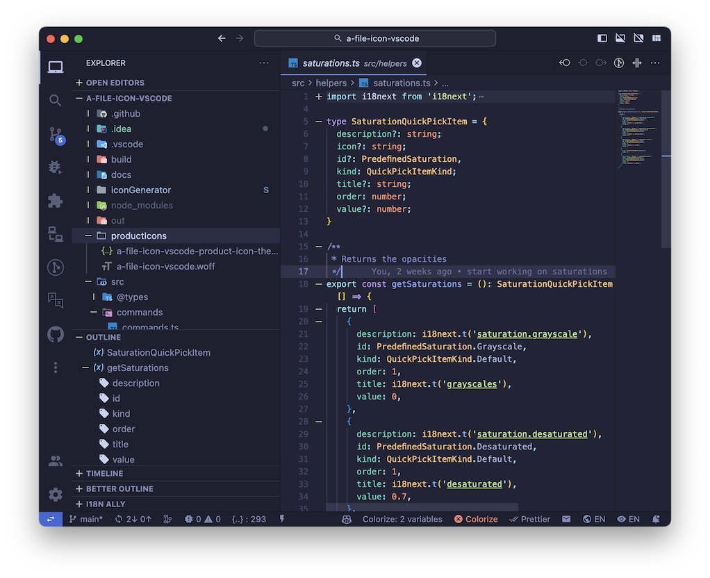
Note: This plugin has also ben ported to VSCode as well! Go take a look: Atom Material Icons
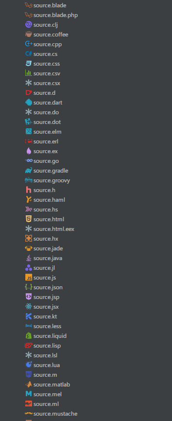
File icons
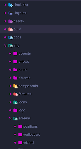
This setting changes the icons for project files according to specific file patterns. Usually, it’s based off the extension of the file (*.js, *.scss, *.php) but it also identifies specific commonly used patterns and replaces them with the relevant icon, such as:
package.jsonbuild.gradleREADME.mdcomposer.json- etc…
You can find more information at the Associations.
Directory icons
Assign specific folder icons to folders with commonly used names to add yet more visual grepping than with file icons.
For instance, tmp, logs, src, lib or test are folders found within most projects.
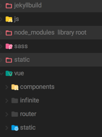
Note that excluded/resource root/test root/package folders won’t be decorated.
You can find more information at the Folder Associations.
Important note: Because of the way it’s implemented, in Rider, you would need to turn off the Low Power Mode switch to see the directory icons.
UI Icons
This setting toggles the replacement of the icons provided by the plugin. Specifically, this disables:
- Menu Icons
- Toolbar Icons
- Tool Window Icons
- Application Icons
Basically, this replaces all icons provided by the plugin, including breakpoint icons, dialog icons and even icons inside documentation panels.
Note: This setting doesn’t affect icons being changed by other plugins.
PSI Icons
This toggle lets you replace the PSI icons (e.g. Class, Interface, Enums, functions, etc) with Material icons.
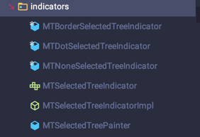
The Structure Panel icons are also changed:
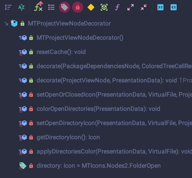
This option makes it look like the Visual Studio Code Outline Panel, as well as Rider or Resharper structure panels.
Hide file icons
This option allows you to completely hide the file icons from the IDE. It hides them from the Project Tree, Tabs, Dialogs and everything. Folders are unaffected, though.
Note: This feature takes precedence over default file icons providers, and the plugin’s own ones. However, some plugins might have an even greater precedence, meaning you would still see icons from such plugins.
Hide folder icons
Same setting as the Hide File Icons except that it works for folders.
Monochrome icons
This option allows you to apply a monochrome filter to the whole IDE, just like the color blindness filter. This is ideal for people who don’t like the avalanche of colors provided by the different icons.

By applying this filter, all icons will be filtered with a shade of the primary color, that is, the color of the items in the Project View of the current theme.
Note: This setting not only filters out the toolbar and file icons, but even tool window icons, debugger icons, etc…
Hollow folders
This feature further decorates the Project View by emphasizing the folders that contain files that are currently open in the editor, making them appear as “hollow”.
Not only regular folders, but also excluded folders, resource folders or even decorated folders have a hollow counterpart.
Custom icon size
This option allows you to change the size of the icons ranging from 12px to 24px.
Moreover, it adapts the Project View Items’ height to the new size.
Note: The IDEs aren’t optimized to handle bigger icons, so there could be parts of the IDE that are missing icons, or that the containers will appear larger/wider/bigger. Please be aware of such issues when using this setting.
Arrows style
This setting allows you to change the style of the arrows in trees such as the Project Tree or Settings Tree (TODO).
There are the available styles:
| Style | Screenshot |
|---|---|
| Material |  |
| Darcula |  |
| Plus-Minus |  |
| Arrows |  |
| None | (no arrows) |
You can also switch styles in the Actions Panel.
Custom accent color
This option will let you override the Accent Color set for some icons, such as the Checkboxes.
Note: This custom color will be overriden by the Accent Color set by the Material Theme UI plugin.
Custom themed color
Some icons are colored with what’s called the Themed Color. It’s a dynamic color, which matches up the current UI Theme. Examples of such icons are:
- Regular Folder Icons
- Unchecked checkboxes
- Unselected radio buttons
- Expand Arrows
- And some others
By default, this color will be the same as the text color in trees, but this setting will allow you to override it with the color of your choice.