The Material Theme UI plugin comes with a bunch of features tailored for an optimal experience. However, it’s also highly configurable to allow everyone to customize it to their hearts’ content.
Themes and color schemes
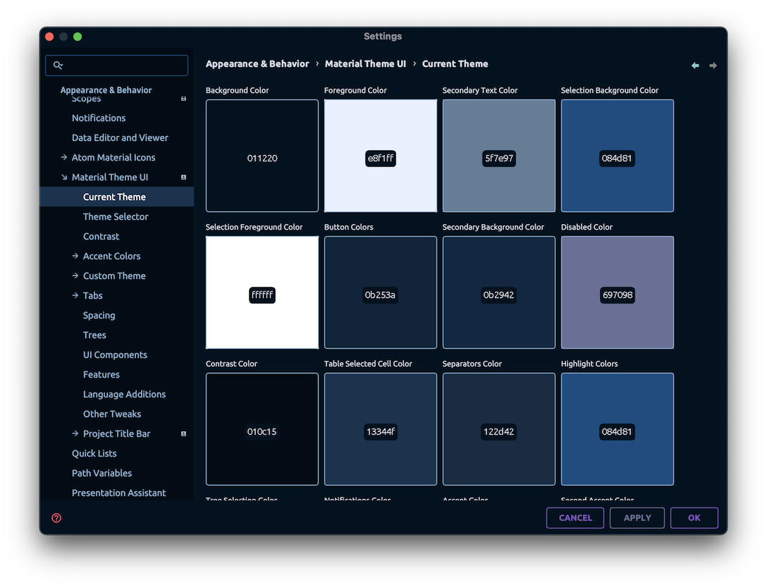
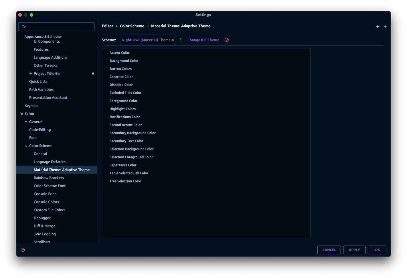
Current Theme
Since version 9.0.0, you can see the current theme’s colors from the settings page.
For this, navigate to Settings → Appearance → Material Theme UI → Current Theme.
Theme switcher
The plugin comes prebundled with a set of themes interchangeables through the
 Theme Switcher.
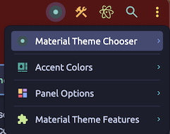
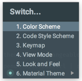
There are many ways to invoke the Theme Switcher:
- From the IDE menu
Tools → Material Theme → Material Theme Chooser - From the Main Toolbar
- From the
Search Everythingdialog, typeMaterial Theme - From the
Quick Switchpanel (Ctrl + \`) (Windows: Ctrl + ~)` - From the
Status Bar Widget
Alternatively, you can also switch themes using the Theme Selector found in Settings → Appearance → Material Theme UI → Theme Selector.
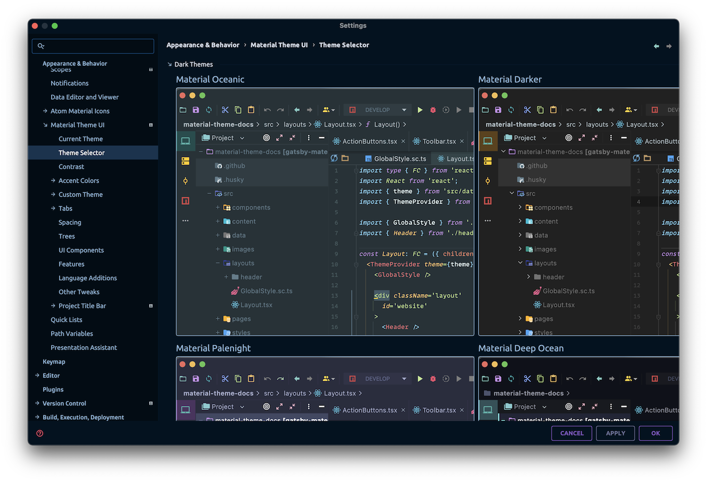
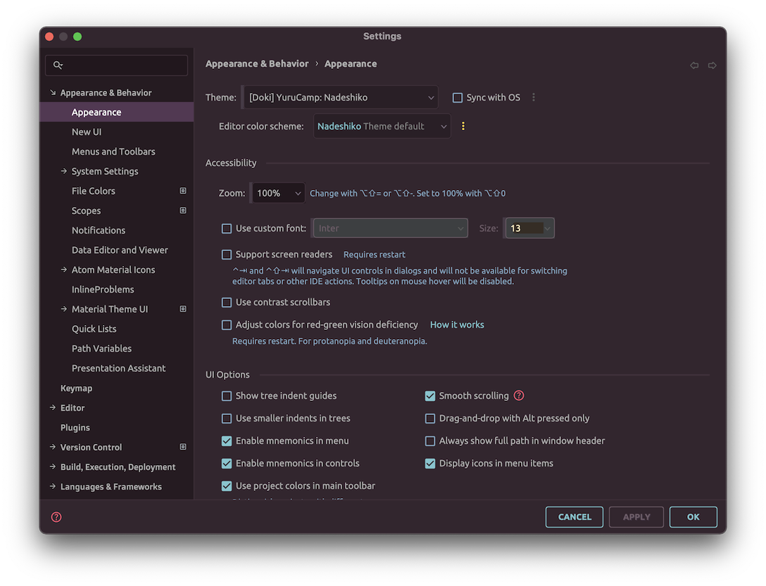
The plugin comes prebundled with 23 themes:
Material themes
These themes are based on the original themes, made by Mattia Astorino (@equinusocio)
-
Oceanic
An oceanic blue flat theme
-
Darker
A pitch-black flat theme
-
Lighter
A bright light flat theme
-
Palenight
A purplish flat theme
-
Deep ocean
A deep sea black flat theme
-
Forest
A forests and trees based flat theme
-
Sky blue
A clear and light blue flat theme
-
Sandy beach
A sandy based flat theme
-
Volcano
A rock and fiery based theme
-
Space
An dark blue and purple spacey theme
Other themes
Besides the Material Themes, there are other prebundled themes made by the community:
-
Monokai pro
Theme based on the Monokai Pro Theme
-
Dracula
Theme based on the Dracula Theme
-
Github
Theme based on the GitHub UI
-
Github dark
Theme based on the GitHub Dark UI
-
Arc dark
Theme based on the Arc Dark GTK Theme
-
One dark
Theme based on the Atom One Dark theme
-
One light
Theme based on the Atom One Light theme
-
Solarized dark
Solarized Dark Theme
-
Solarized light
Solarized Light Theme
-
Night owl
Theme based on Night Owl by Sarah Drasner
-
Light owl
Theme based on Light Owl by Sarah Drasner
-
Moonlight
Theme based on the Moonlight Theme by Atomiks
-
Synthwave '84
Theme based on the SynthWave' 84 theme by Robb Owen
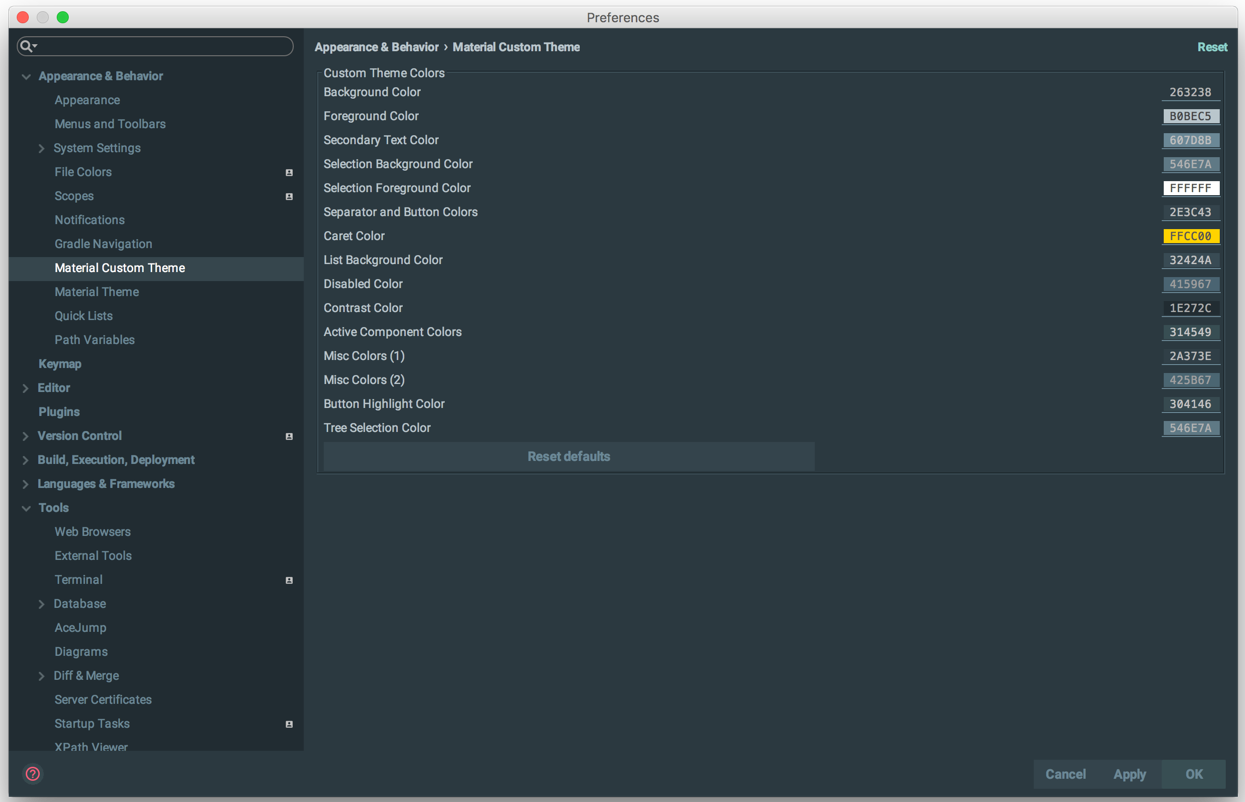
Custom Themes
This feature is only available for premium users.
In addition, premium users can also define their own Custom Themes.
There are two options available, Custom Theme for dark themes and Light Custom Theme for light themes.
See Custom Themes for more information.
Native Themes
The plugin supports Native Themes as well, that is, themes using JetBrains theme API. When loading a native theme, the plugin would try to convert it into a Material Theme, thus allowing you to use the theme colors while using the Material Theme features such as the components, accent mode, etc.
You don’t need to do anything to make it work, download a native theme and select it. It will be automatically converted to a theme format supported by the plugin.
Examples:
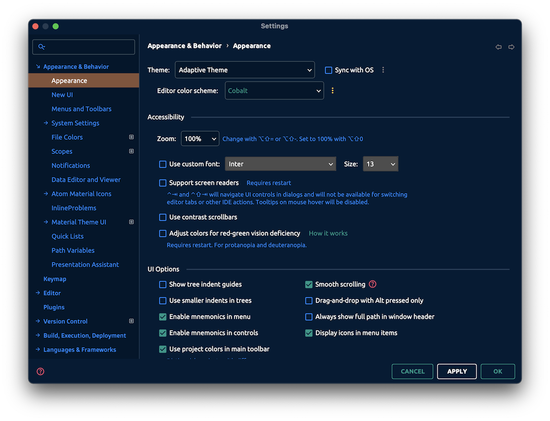
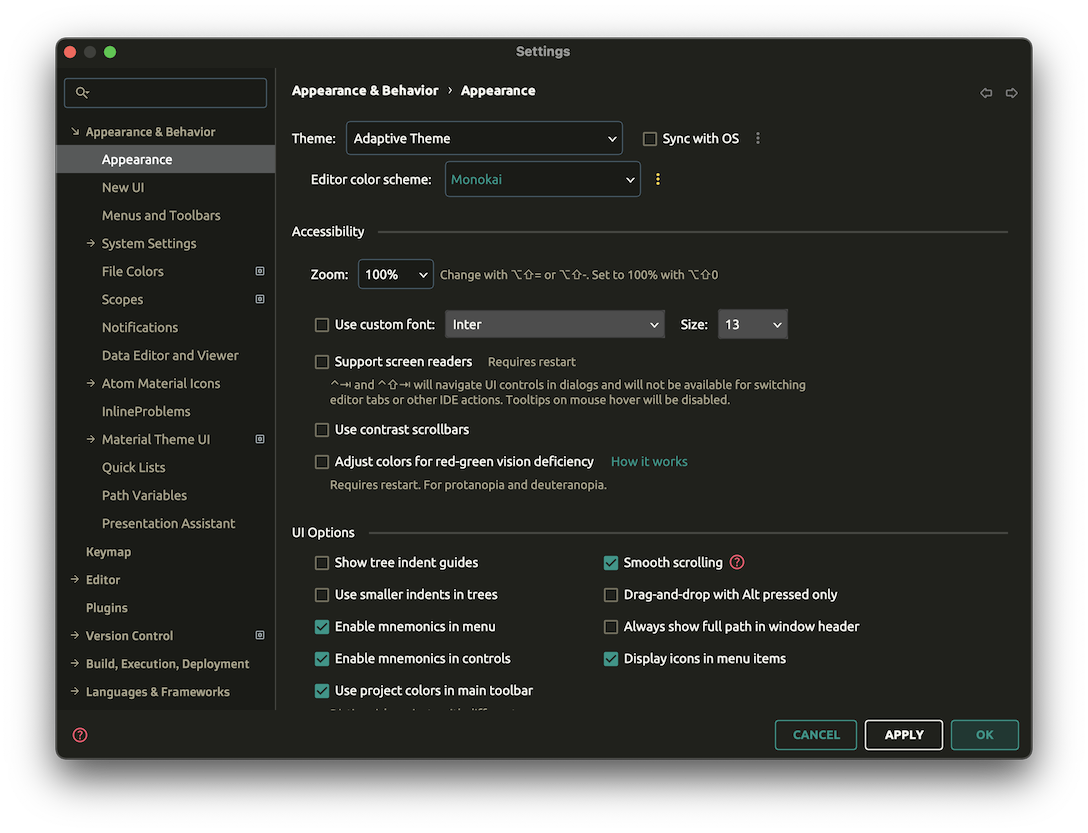
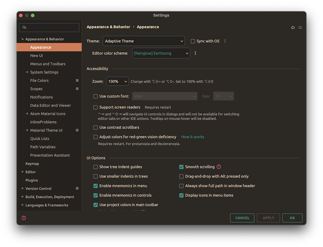
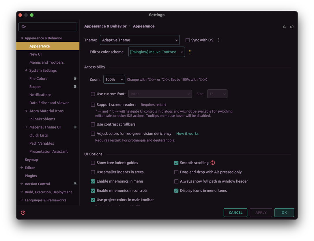
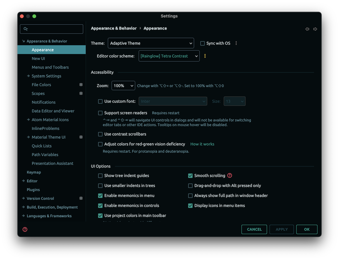
Adaptive Theme
This feature is only available for premium users.
Last but not least, since version 9.0, the plugin also comes with an Adaptive Theme. This theme automatically changes its colors based on the current color scheme.
This theme is quite useful if you have a lot of color schemes that do not come with their own UI Themes, such as the Rainglow color schemes.
Examples:
You can also override the Adapative Theme’s colors from a Color Scheme Settings Page. This way, you can customize your UI theme directly from the Color Scheme settings!
Material Theme UI settings
Settings Page
Some settings are only available for premium users.
You can configure many parts of the plugin features from the plugin settings.
They’re available within the Settings → Appearance → Material Theme UI.
Since version 9.0, the settings page has been split into multiple settings pages, for easier navigation and maintenance.
Summary
Here’s an exhaustive list of all available settings:
In this page, you can view the current theme’s colors. You can also click on a color to copy it to the clipboard.
- Theme Selector: Select a theme from the list of pre-bundled themes. You’ll get a small preview of the theme for easier selection.
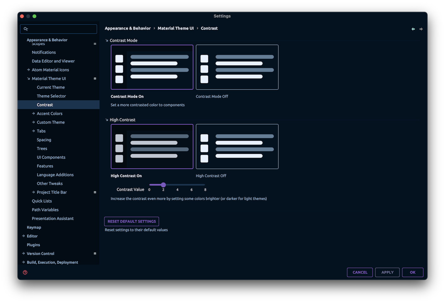
- Contrast Mode: Add contrast to specific panels and components.
- High Contrast
 : Set a more pronounced contrast, by making the texts more prominent.
 - Contrast Value: Fine tune the contrast value. The more you increase it, the more contrast you get.
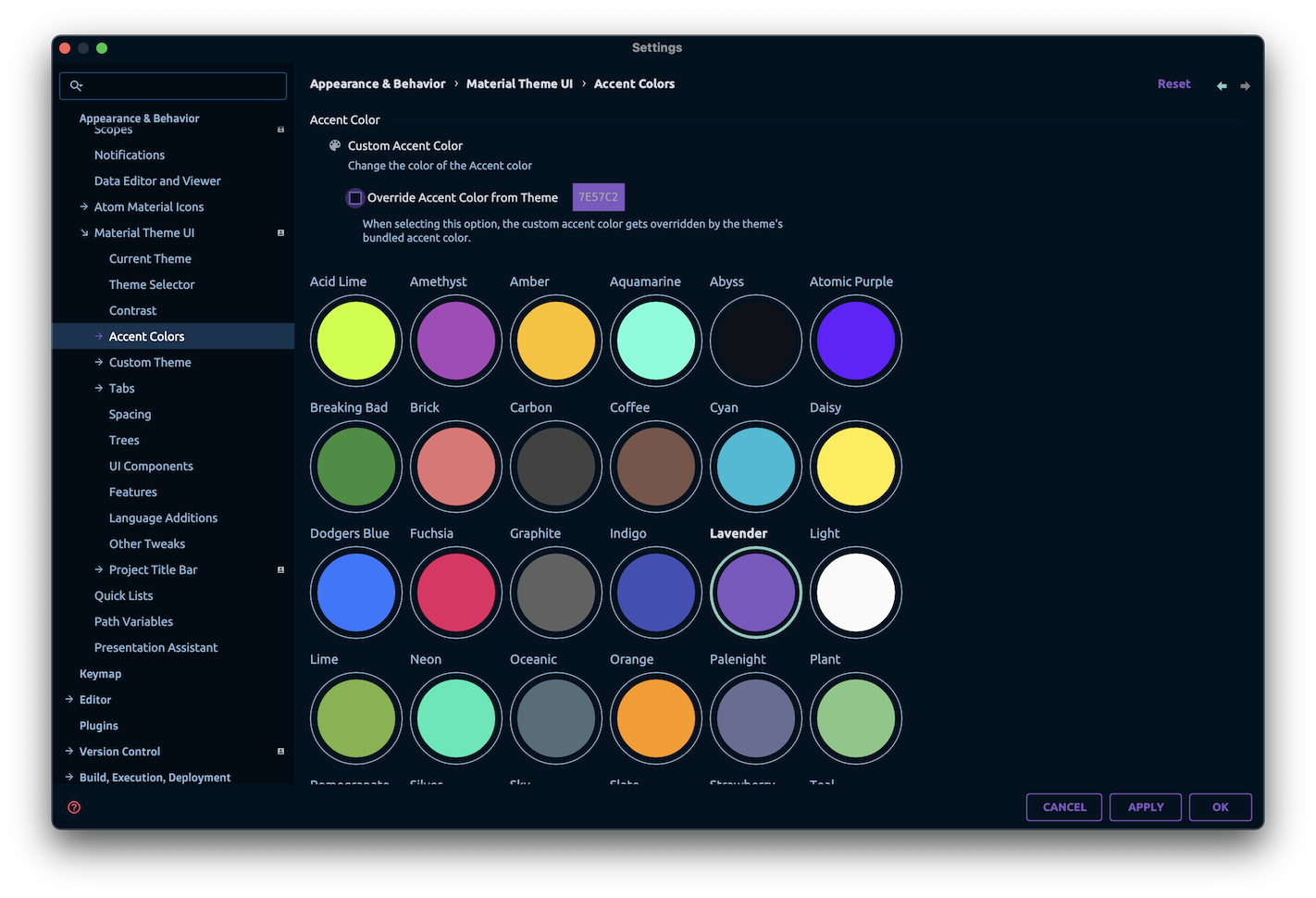
- Custom Accent Color: Set a custom accent color.
- Override Accent Color from Theme: Use the theme’s accent color.
- Custom Accent Color: Set a custom accent color.
- Predefined Accent Colors: Choose from a list of predefined accent colors.
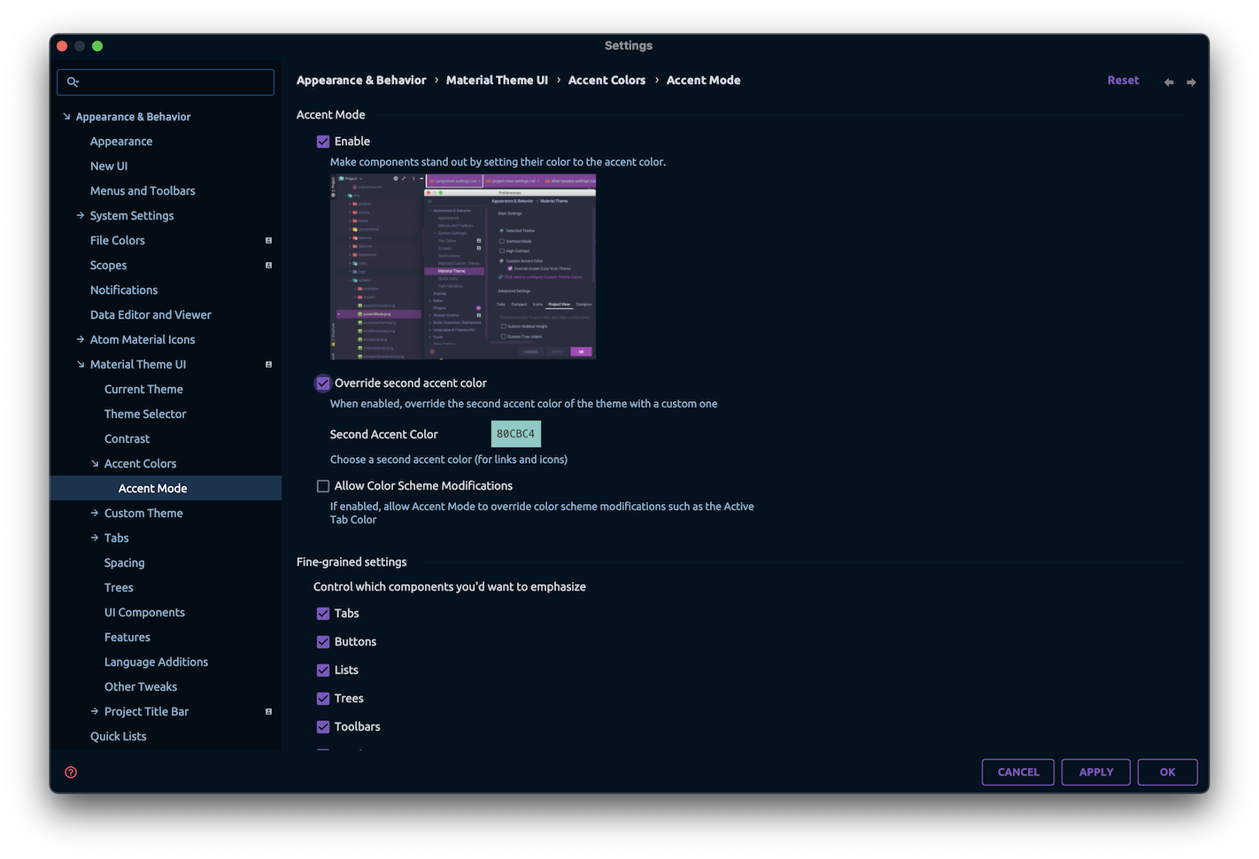
- Accent Mode: Make components stand out by painting them in the accent color (buttons, tabs, selections…).
- Second Accent Color: Specify a second accent color to contrast with the primary accent color.
- Allow Color Scheme Modifications: Modify the current color scheme to replace some elements with the primary or secondary accent color, such as links, tab highlighter, selections, etc.
- Fine-grained settings: Instead of applying accent mode globally, you can decide to apply it only to specific components.
- Buttons: Primary buttons
- Tabs: Selected tabs
- Lists: Selected elements in lists
- Trees: Selected elements in trees
- Toolbars: Some toolbars
- Notifications: Notifications
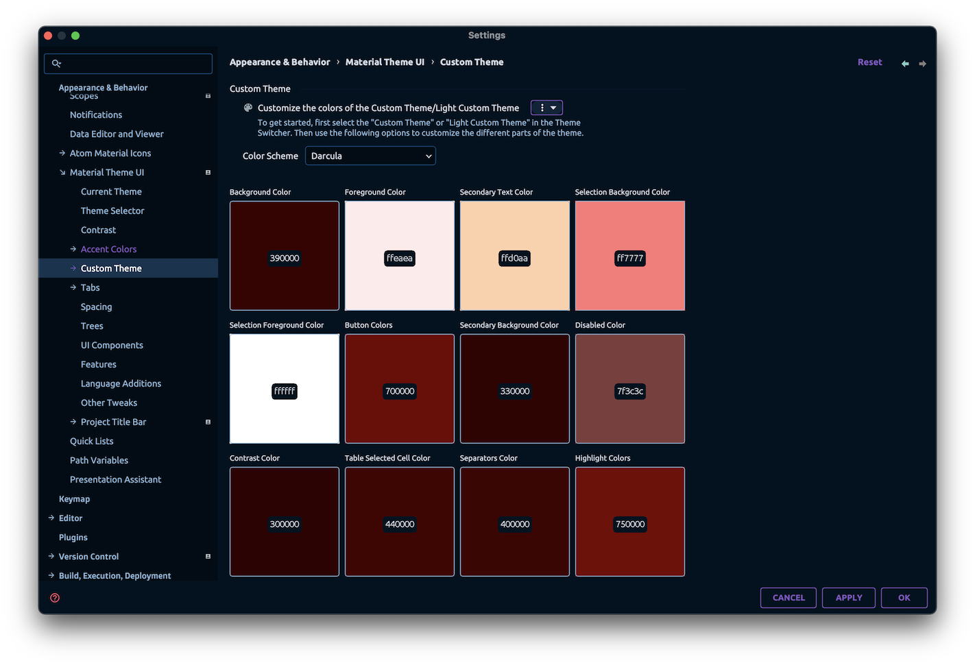
- Custom Theme: Configure the colors of the Custom Theme
- Color Scheme: Select a color scheme to be loaded alongside your custom theme.
- Load from XML: Import a custom theme in XML format.
- Save to Disk: Export your custom theme to an XML file.
- Light Custom Theme: Configure the colors of the Light Custom Theme.
- Color Scheme: Select a color scheme to be loaded alongside your custom theme.
- Load from XML: Import a custom theme in XML format.
- Save to Disk: Export your custom theme to an XML file.
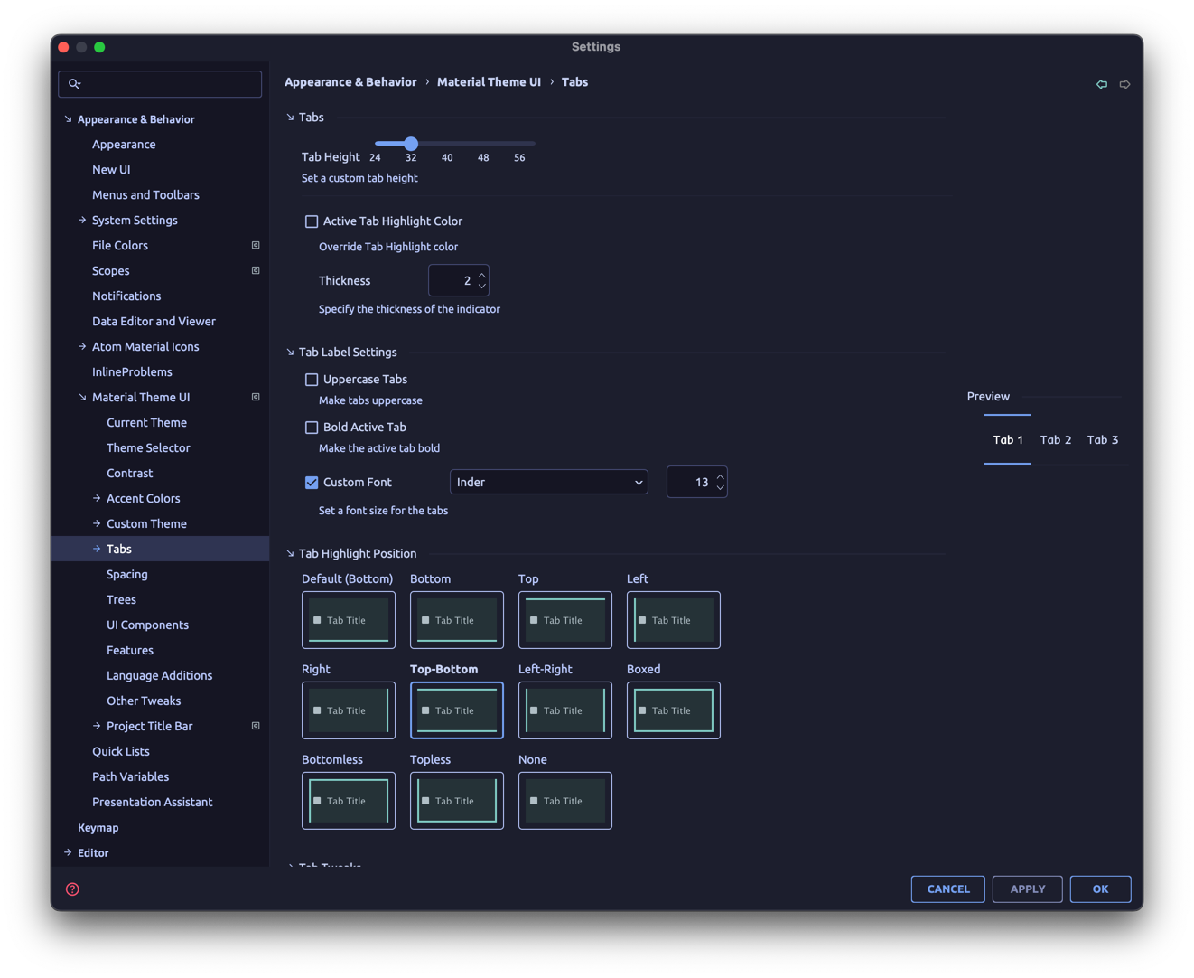
Tabs:
- Tabs Height: Customize the tabs’ height (between
25and60pixels). - Active Tab Highlight Color: Customize the active tab’s indicator color.
- Thickness: Set the active tab’s indicator thickness.
- Uppercase Tabs: Set the tabs’ text to uppercase.
- Bold Active Tab: Make the active tab bold.
- Custom Tab Font: Control the font and size of the tabs.
- Tab Highlight Position: Customize the position of the tab highlighter.
- Tabs Shadows: Add a subtle shadow under the tabs.
- Animated Tabs: Animate the tab indicator upon switching tabs
- Tab Separators: Add thin borders between tabs
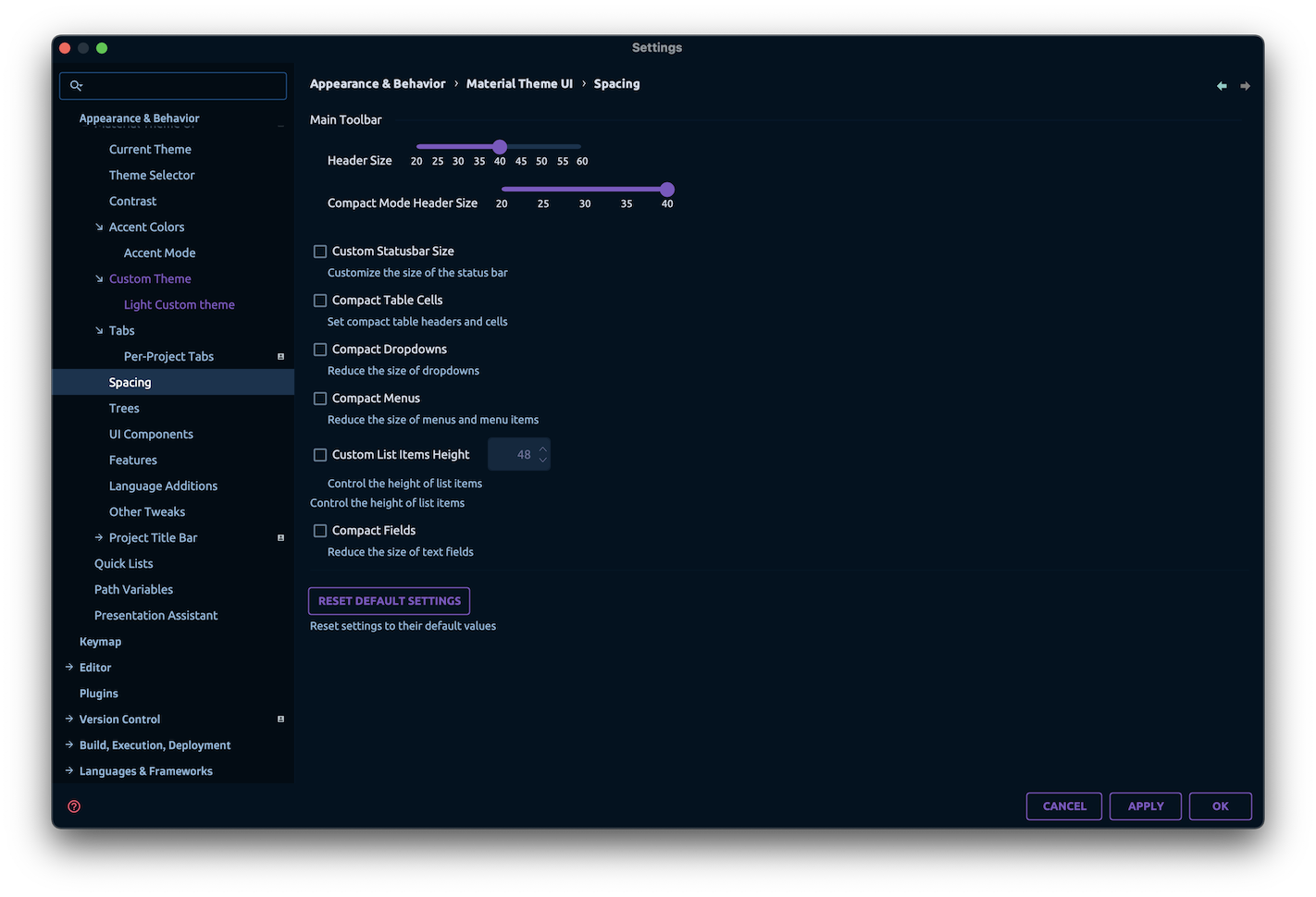
- Header Size: Control the size of the header.
- Compact Mode Header Size: Control the size of the header in compact mode.
- Custom Statusbar Size: Control the size of the status bar.
- Compact Table Cells: Reduce the height of table headers and table cells.
- Compact Dropdowns: Reduce the size of dropdowns.
- Compact Menus: Reduce the size of the menus.
- Custom List Items Height: Control the size of items in lists and dropdowns (min:
18, max:48). - Compact Fields: Reduce the size of fields, such as input, numeric and passwords.
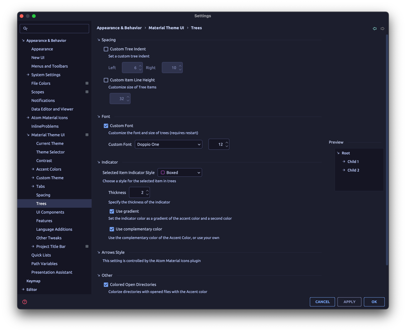
- Custom Tree Indent: Fine tune indent of tree items.
- You can configure both the Left and Right indents.
- Custom Line Item Height: Set custom line height in trees (min:
18, max:44). - Custom Tree Font: Customize the font and font size of the project trees.
- Selected Indicator Style: Change the style of the indicator for selected item in trees.
- Border: Add a small rounded border to the left
- Dot: Add a dot to the left of the selected item.
- Sharp: Add a small sharp border to the left
- Right Border: Add a small rounded border to the right
- Boxed: Add a box around the selected item
- Underline: Add an underline to the selected item
- None: Remove the indicator
- Thickness: Control the thickness of the indicator.
- Use Gradient: Use a gradient instead of a single color for the indicator.
- Use complementary color: If using a gradient, use the complementary color of the accent color for the gradient.
- Arrows Style: Change the style of the arrows in the trees.
- Material: Material UI Styled Arrows (chevrons)
- Darcula: Darcula Styled Arrows (triangles)
- Plus-Minus: Plus and Minus signs
- Arrows: Simple arrows
- Circle: Circled arrows
- None: No arrows
- Colored Open Directories: Assign a specific style to directories. Can be configured from the Custom File Colors settings page.
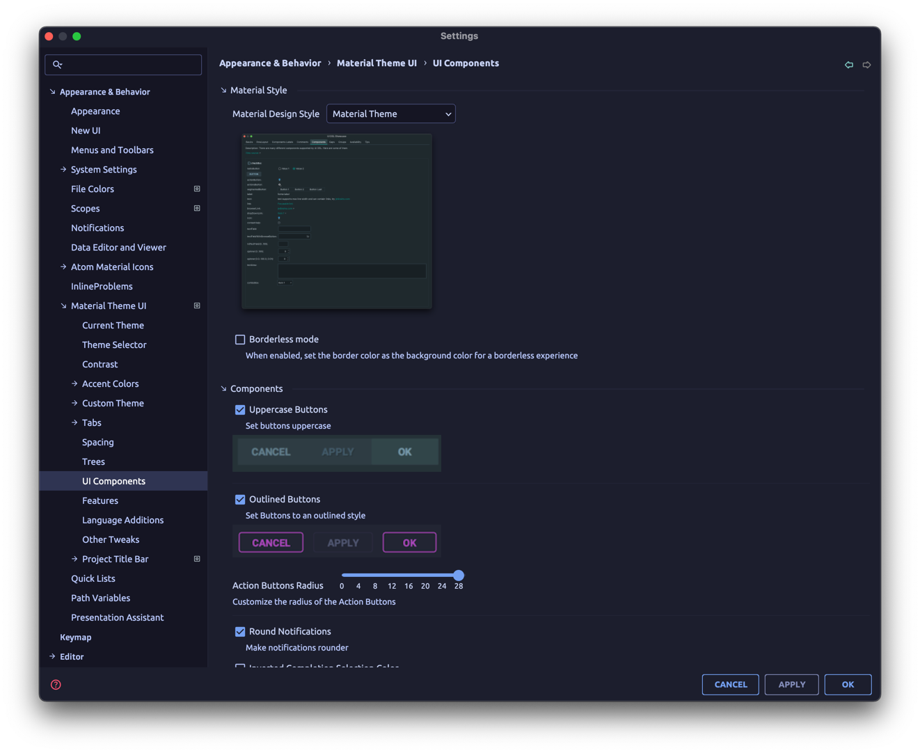
- Material Design Style: Select the style of the components.
- Legacy Material Design: Use the old Material Design style (sharp corners, borderless input fields…).
- Material Theme: Use the Material Theme style (rounded corners, bordered input fields…).
- Material You (NOT RELEASED YET): Use the Material You style (rounded buttons, input fields…).
- Borderless Mode: Remove most borders and separators
- Uppercase buttons: Set the buttons’ texts to uppercase.
- Outlined buttons: Use outline buttons instead of full buttons.
- Action Buttons Radius: Customize the radius of the action buttons.
- Round Notifications: Make notifications rounder.
- Inverted Completion Selection Color: Switch the Autocomplete’s selected item color between the selection color and contrast color.
- Accent Scrollbars: Set the color of the scrollbars to the accent color (requires restart).
- Transparent Scrollbars: Enable/Disable transparency in scrollbars (requires restart).
- Extra Shadows: Add a subtle shadow around notifications and some popups.
- Material Circular Loader Icon: Replace the loading icon with a Material Design circular loader icon (available only in conjunction with the Atom Material Icons plugin).
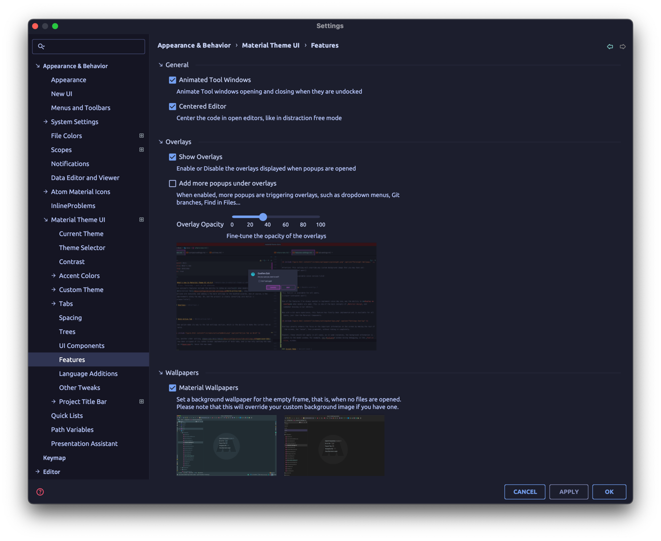
- Animated Tool Windows: Animate opening and closing on tool windows when they are undocked.
- Centered Editor: Centers the code in open editors, like in distraction free mode.
- Show Overlays: Displays an overlay when modals are open.
- Add more popups under overlays: When enabled, triggers overlays for more popups, such as right click menus, dropdowns, etc.
- Overlays Opacity: Customize the opacity of the overlays
- Material Wallpapers: Add a custom wallpaper per theme for the empty frame window.
- Custom UI Font: Set your own custom UI Font. Supplements the IDE’s Custom Font.
- Material File Status Colors: Enable/Disable the Material File Status Colors.
- Custom Directories Style: Customize the style of directories.
- Automatically reset color scheme: Automatically reset the color scheme on theme activation (only for bundled color schemes).
- Use Editor Default Font: Automatically update color schemes to use the default font of your choice.
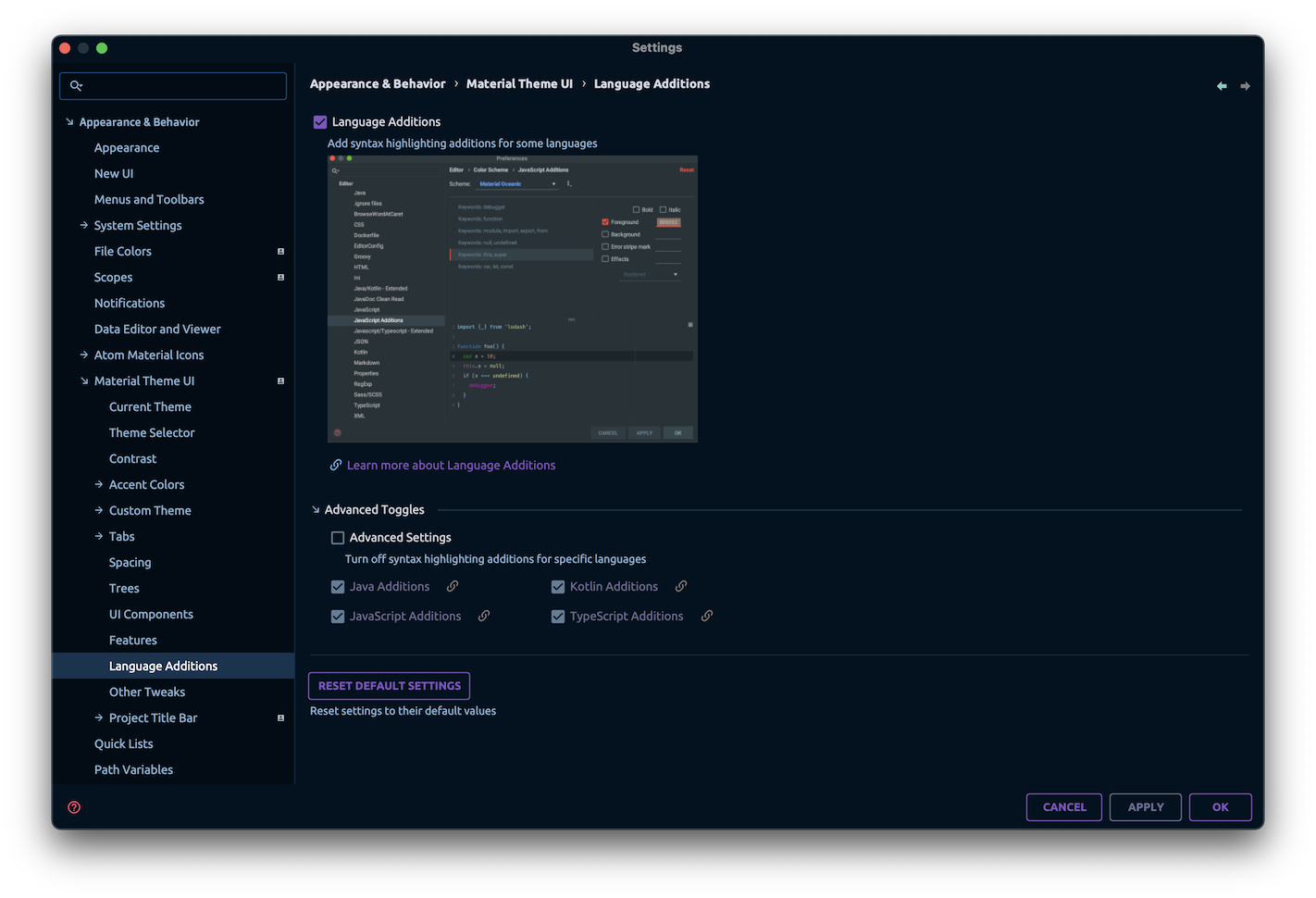
- Language Additions: Enable/Disable the Language Additions.
- Advanced Settings: Turn off language additions for specific languages, depending on the IDE. The available options are:
- Java (IntelliJ IDEA)
- Kotlin (IntelliJ IDEA)
- JavaScript (WebStorm, JavaScript plugin)
- TypeScript (WebStorm, TypeScript plugin)
- Ruby (RubyMine, Ruby plugin)
- Python (PyCharm, Python plugin)
- PHP (PhpStorm, PHP plugin)
- Go (GoLand, Go plugin)
- Rust (CLion, RustRover, Rust plugin)
- Colorize Title Bar: Colorize the title bar with a random color (only for the New UI).
- Colorize Left Tool Window: Colorize the left tool window (only for the New UI).
- Colorize Right Tool Window: Colorize the right tool window (only for the New UI).
- Colorize Status Bar: Colorize the status bar (only for the New UI).
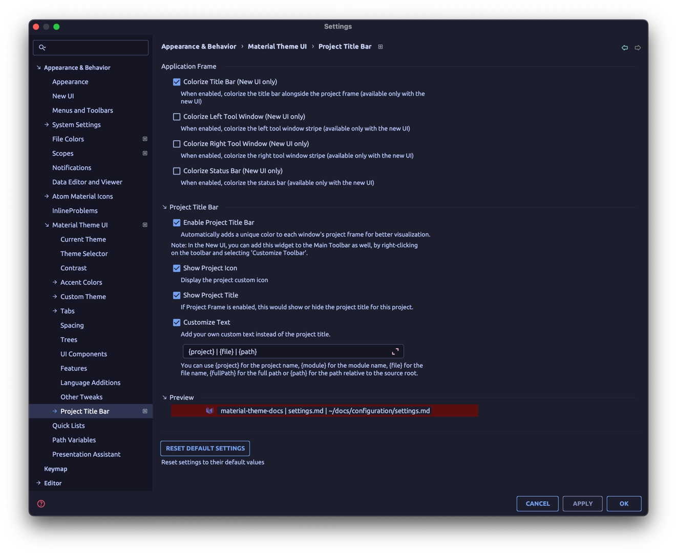
- Project Title Bar: Add a colored stripe on the top of each project window for easier differentiation.
- Show Project Icon: Display the project’s custom icon on the stripe.
- Show Project Title: Displays the project title on the stripe.
- Customize Text: Customize the displayed text.
- You can use the keywords
{project},{module},{fullPath},{path}and{file}to refer respectively to the current project, module, full path, local path and/or current file.
- You can use the keywords
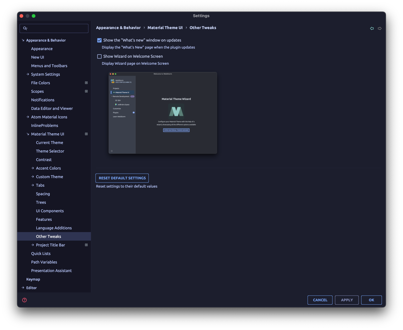
- Show What’s New on each update: Whether to display the What’s New page on each update.
- Show Wizard on Welcome Screen: Add or remove the Wizard option in the Welcome Screen.
Settings shortcuts
You can also quickly toggle some settings by using the Search Everywhere or the Command Panel capability of the IDE.
Simply press Shift-Shift and type Material Theme to get the list of available toggles.
Same goes for the Command Panel (Ctrl-Shift-A/Cmd-Shift-A).
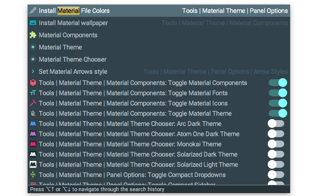
You can also use the Keymap Editor to assign your own custom shortcuts to these toggles.
Settings File
Your current configuration is stored inside the IDE settings’ directory under the filenames:
- Main Settings:
material_theme_new.xml. - Custom Theme:
material_custom_theme_new.xml. - Per Project Settings:
material_theme_project.xml.
If, for some reason, there are issues with the plugin, or you don’t manage to reset to a stable state, delete these files and restart the IDE.
Read IDE Settings and Directories used by the IDE to find out where are stored such configuration files.
The files in question should be located in the following directories:
- within
<config directory>/config - within each project’s
.ideadirectory for the Per-Project Settings.
Custom themes
This feature is only available for premium users.
Aside from the bundled themes, you can also set up your own Material Theme.
You can do so by selecting Custom Theme in the theme list,
then customize the theme colors in the settings page at Settings → Appearance → Material Custom Theme Settings.
Once you set these colors, select the Custom Theme in the Material Theme Chooser and see your colors take effect.
See Custom Theme for more details.
Frequently Asked Questions
Q: I’ve updated the IDE/plugin to a new version, and now I get an error about the plugin failing to initialize?
A: It could come from multiple issues, but it could simply be a problem with the settings not being compatible with the new version.
In that case, make a copy of the settings file, then delete the original file, and restart the IDE.
If the issue is gone, go back to the settings and go back to your previous configuration manually.
If the issue persists, please report it in the Issues Section.
Q: I’ve removed the plugin, and still the background image persists!
A: This is an issue hard to resolve, because the Custom Wallpaper function is using the Set Background image function from the IDE behind the curtains.
Therefore, removing the plugin might not remove the set image completely.
If that occurs, you can remove the image by opening the Command Panel (Cmd-Shift-A/Ctrl-Shift-A)
and type Set Background image and then manually remove the image,
or go into Settings → Appearance → Background Image.
Q: What is that analytics option? What data are collected?
A: This is an option to allow sending data to Material Theme servers about users’ configuration, usage and trends.
These metrics allow us to find out which features are most used or least used, to prioritize development of features, or maybe notify users about specific features, to provide better satisfaction.
These data are completely anonymous, and aren’t shared/sold to any third parties.
If you want to stop sending data, turn off the option in the material_theme.xml.
Q: My settings are lost/jumbled up!
A: As the plugin evolves, sometimes settings are modified or removed, and as a result it can jumble your configuration files.
We’re trying our best to limit such issues, but they can happen nonetheless.
If you find yourself being unable to use the plugin or even run the IDE, try to delete your configuration files, or at least try to delete specific properties until the IDE launches again.
Q: The wizard idea was great! But I’ve made a mistake, and the wizard won’t show up anymore!
A: The wizard shows only once and only when you don’t have the isWizardShown option set to true in the config file.
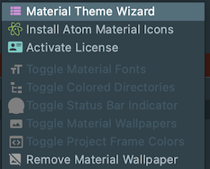
But you can reopen it by simply clicking on the action from the Material Theme Toolbar, on the Features menu.
Q: Where have all the icons gone?
A: Since 5.0.0, the icons related settings have been moved to the Atom Material Icons plugin, another plugin developed by the Material Theme team.
This is to encourage developers to develop Icon Themes, as the plugin is now free of icons.
Q: I’ve downloaded a theme from the Plugins Page, and now I’m seeing texts that aren’t themed, or checkboxes that are wrongly colored, etc…
A: This is because these are native themes, and such themes use the Theme API provided by JetBrains rather than the API used by the Material Themes.
Even though the plugin tries to convert it to its own format, it won’t be as good as the originals. Still, it should be as similar as possible, so there shouldn’t be any critical issues. In that case, please report to the repository’s issues.
Q: I’ve bought a license, but I am still identified as a Free User!
A: That means that you haven’t activated your license yet. At the moment, the only way to do it, is to run the action to open the Registration Modal.
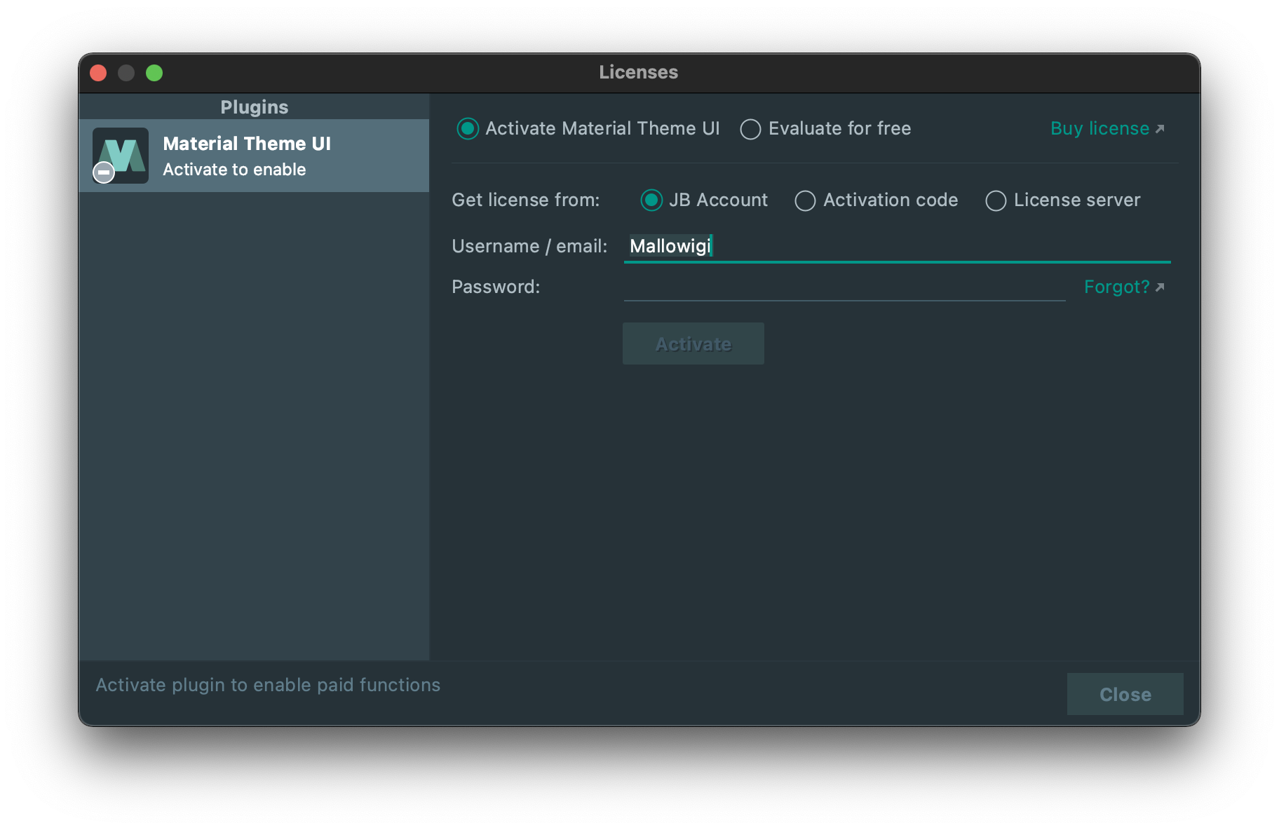
Important note: Android Studio users, to activate the plugin (or any paid plugin), you need to install a plugin first:https://plugins.jetbrains.com/plugin/13407-jetbrains-marketplace-licensing-support.