UI Components Settings
Customize various components of the IDE.
These settings provide you with a wide range of customization options for various IDE components.
Look And Feel
Section titled “Look And Feel”
Material Design Style
Section titled “Material Design Style”This setting allows you to choose between three Material Design styles, each offering a distinct visual experience: Material Design, * Material Theme*, and Material You.
Material Design (Material 1)
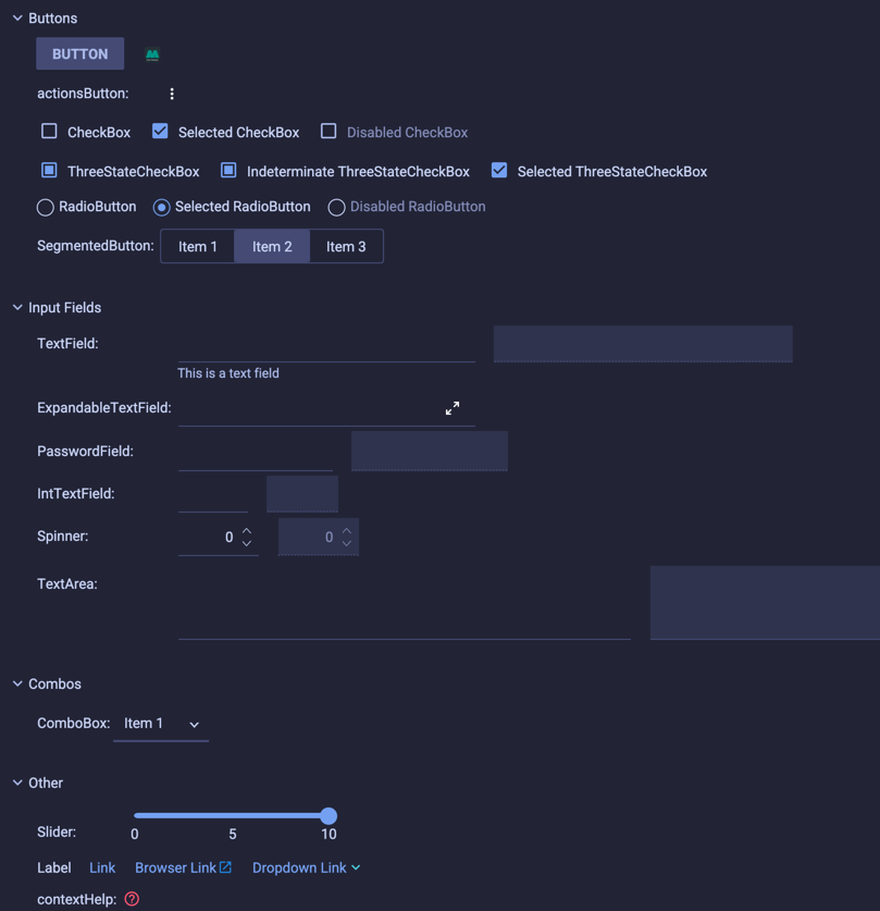
Section titled “Material Design (Material 1)”The first iteration of Material Design from Google features flat, rectangular elements with consistent spacing and shadows to convey depth. Input fields blend seamlessly with the background by omitting borders, Roboto serves as the primary font, toggled elements display an overlaid circle indicator, and selected tabs are marked by an underline.
Material Theme (Material 2)
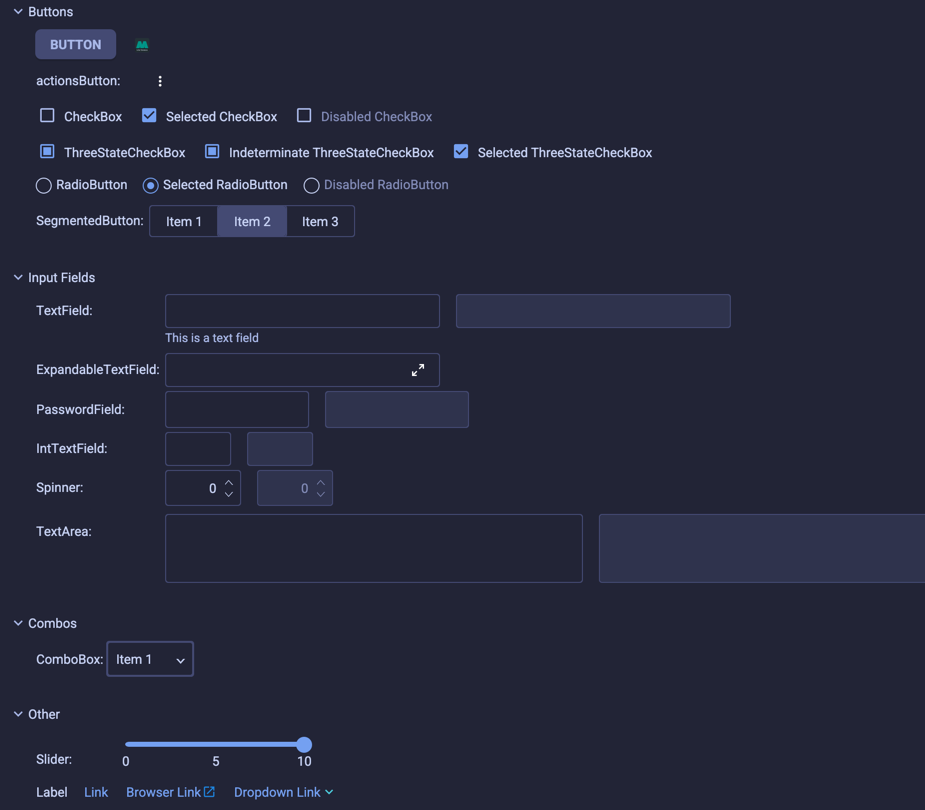
Section titled “Material Theme (Material 2)”Material Theme builds upon the same principles as Material Design while introducing a more modern and refined aesthetic. It incorporates softer, more rounded elements with enhanced emphasis on color and typography. Input fields now include borders for clearer distinction from the background, Roboto remains the primary font, menus and popups feature rounded corners, and most elements maintain Material 1’s core principles with increased roundness throughout.
Material You (Material 3)
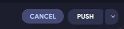
Section titled “Material You (Material 3)”The latest iteration, Material You, introduces a more dynamic and contemporary design language. Input fields and buttons feature prominently rounded borders, Google Sans replaces Roboto as the primary typeface, and rounded corners appear throughout the interface. Tabs are now represented by a rounded indicator instead of a solid line, offering improved visibility and a more cohesive visual style.


Borderless Mode
Section titled “Borderless Mode”The Material Theme UI designs feature very subtle borders and separators to create an “almost-flat” experience. However, you can take this further by blending borders completely with the background.
This option replaces the color of various borders and separators with the background color, simulating a pure borderless interface.


Components
Section titled “Components”Uppercase buttons
Section titled “Uppercase buttons”This setting changes the button text to uppercase, giving it a look reminiscent of Material Design guidelines.


Outline buttons
Section titled “Outline buttons”This setting gives buttons an alternate look, sporting a transparent background, and the border and text having the color of the current accent color, making them looking like “outlined buttons”.

Custom Button Radius
Section titled “Custom Button Radius”By default, the buttons have a different radius depending on the Material Design Style selected:
- Material 1: 0px
- Material 2: 8px
- Material 3: 20px
However, if these defaults don’t suit your tastes, you can use these settings to change the radius of the buttons.


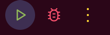
Custom Action Buttons Radius
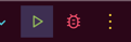
Section titled “Custom Action Buttons Radius”Like the Custom Button Radius, this setting allows you to change the radius of the action buttons, which are the buttons found in the toolbars and some popups. In this case, the default value is always 20px, giving it a full circle shape.
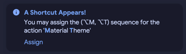
Round Notifications
Section titled “Round Notifications”This setting allows you to make the notifications round.
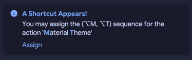
Outline Notifications
Section titled “Outline Notifications”You can also select an alternative style of notifications: Outline Notifications. With this style, the notifications will have its background color mixed with a small tint of the Accent Color, and with an accented border color.
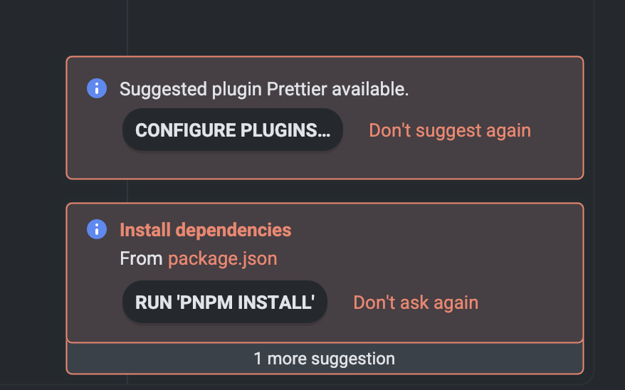
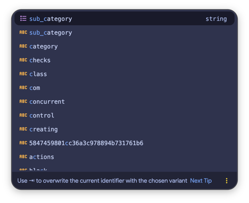
Inverted Completion Color
Section titled “Inverted Completion Color”This setting gives you the choice to change the color of the selected line in the autocompletion popup. When selected, it uses the Contrast Color instead of the Selection Color.

Search Everywhere
Section titled “Search Everywhere”Customize Search Everywhere
Section titled “Customize Search Everywhere”This section allows you to customize many aspects of the Search Everywhere popup, such as the padding, or the font size.
Custom Input Padding
Section titled “Custom Input Padding”This setting allows you to customize the size of the search input field. The more padding, the bigger the input will become. The default value is 12px.


Font Size Delta
Section titled “Font Size Delta”In addition, this setting gives the ability to increase or decrease the font size of the search field.


Scrollbars
Section titled “Scrollbars”Transparent scrollbars and accent scrollbars
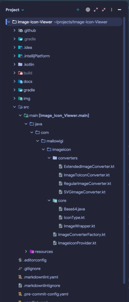
Section titled “Transparent scrollbars and accent scrollbars”These options control the appearance of the IDE’s scrollbars. Please note that this doesn’t affect the scrollbars in the editor; for those you have a dedicated setting page: Scrollbars Color Scheme.
- When both options are unchecked, the scrollbars will sport the same color as the foreground color.
- Transparent scrollbars: make scrollbars 50% transparent.
- Accent scrollbars changes the scrollbar color with the current theme’s accent color.
- When both options are checked, the scrollbars will be accent colored and 50% transparent.



Important: this feature works natively on Windows and Linux, but on macOS it’s dependent on the “System Scrollbars” setting.

Extra Shadows
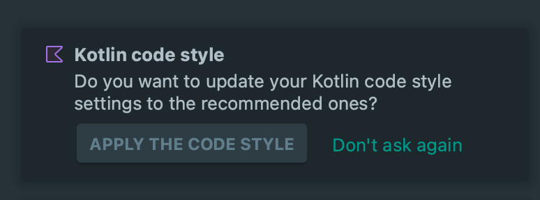
Section titled “Extra Shadows”This small tweak adds a shadow to some popups and notifications.
Circular Icon Loader
Section titled “Circular Icon Loader”This setting replaces the default icon loader (the gear-like animated icon) with the Material Icons’ circular loader icon.


Use Original Tool Window Buttons
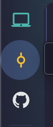
Section titled “Use Original Tool Window Buttons”The plugin replaces the appearance of the tool window buttons with a circular, transparent shape on hover, and a fully squared, transparent shape for opened tool windows.
This setting allows you to revert to the original tool window appearance instead.
Theme
Material
Material (more)
Other
Other (2)
Other (3)